- Diana Gabor, UX/UI Designer at BoatyardX
There’s a common belief in the digital world: paying for something guarantees a better experience. Premium plans, ad-free apps, and gated content promise superior quality—but is this always true?
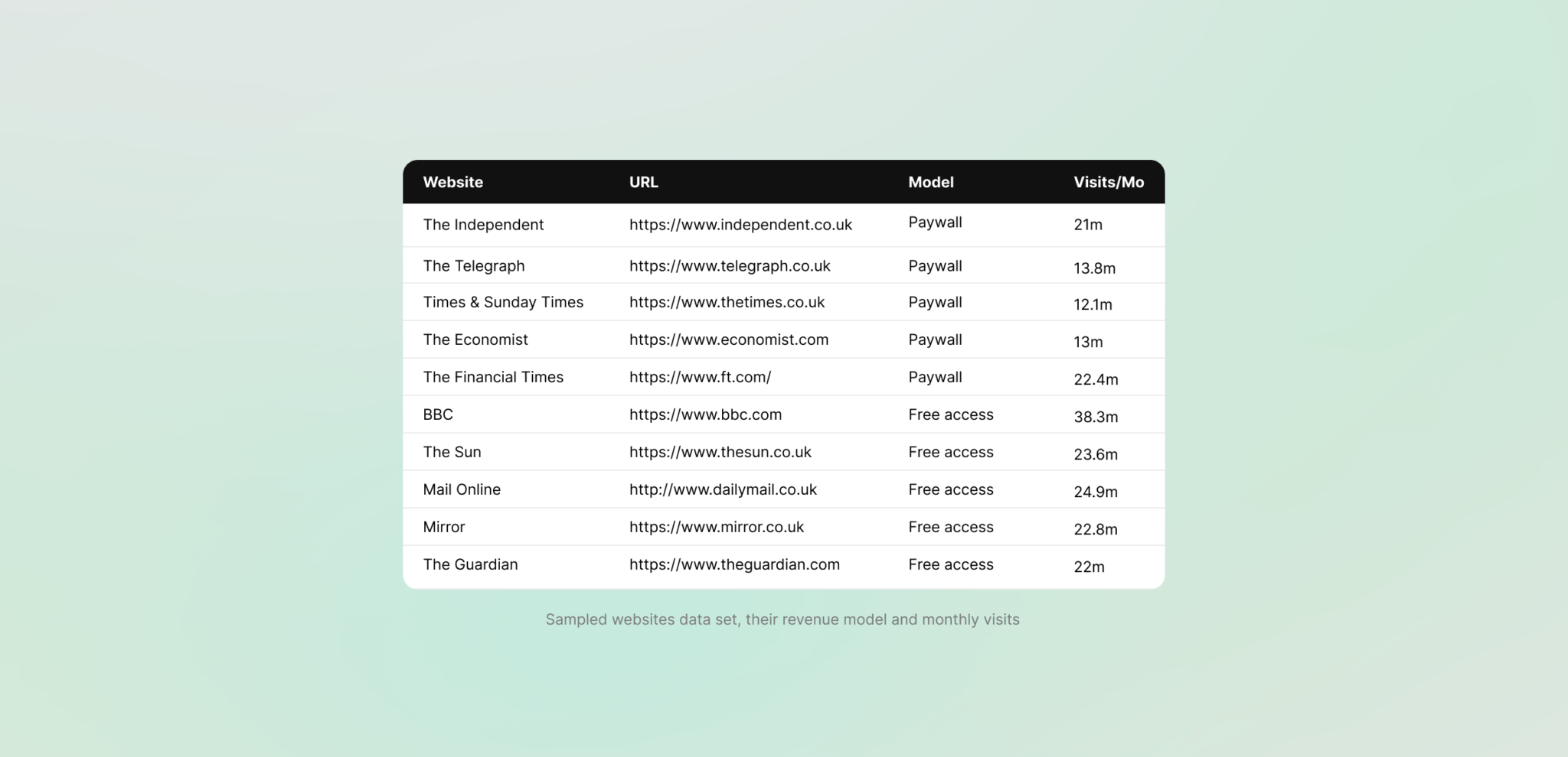
To find out, we turned our heads towards the digital news industry and conducted a detailed analysis of 10 popular U.K. news websites split evenly between free-access platforms and those using paywalls. The goal? To determine what makes some digital experiences stand out while others miss the mark and share some lessons that anyone building a website or launching a digital product can use.
Why news websites matter for UX insights
News websites might not be the first thing that comes to mind when you think of UX best practices, but they’re aspiring for success in a widely competitive and complex landscape:
- They’re under a lot of pressure: Few other platforms must serve such a demanding and diverse audience and compete in a high-stakes game where attention spans are short, and alternatives are just a click away.
- They must stay ahead of the curve: Because of their massive reach, news websites are forced to innovate quickly. What works for them can work for any digital product.
- They reflect user expectations: Whether it’s a reader skimming headlines or a shopper scrolling for deals, the principles of great UX apply universally.
Our analysis approach
We relied on a combination of three distinct industry-standard evaluations methodologies. Each offered us unique insight into how well these platforms delivered a positive user experience.
1. Performance Audit
We used Lighthouse, a performance evaluation tool offered by Google to measure loading speed, interactivity, and responsiveness on desktop and mobile and assessed homepage and article metrics.
2. Usability Audit
We performed a heuristic evaluation by applying Jakob Nielsen’s 10 usability principles to identify common pain points within the navigation focusing on clarity, error prevention, and ease of interaction.
3. Accessibility Audit
Benchmarked each site’s article page against WCAG (Web Content Accessibility Guidelines) standards. We reviewed elements like contrast ratios, font scalability, and keyboard navigation.
Speed: first impressions matter
Let’s start with performance. Imagine clicking on a website, waiting… waiting… and then leaving before the page even loads. That’s what 53% of users do if a site takes more than three seconds to load. Speed is non-negotiable; long loading times can drive users away before they engage. Here’s how the news sites scored:
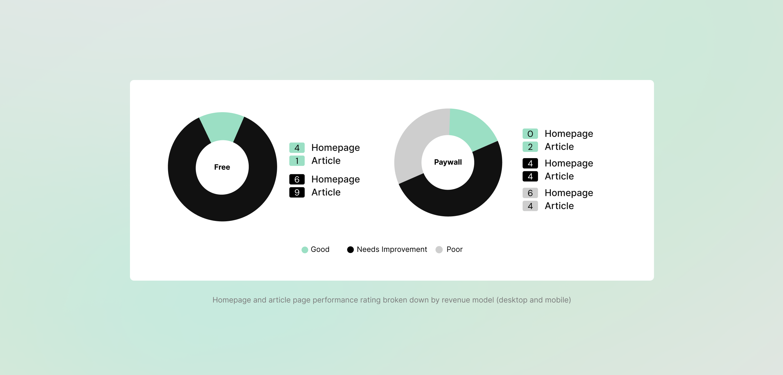
- Free platforms excel at homepage speed: Free websites like The Sun did well for homepage speed, scoring an impressive 79 out of 100 in our Lighthouse tests.
- Paid platforms deliver better depth: On individual article pages, paid sites like The Independent came out on top with scores averaging around 84 out of 100.
- Mobile struggles: Across the board, mobile performance underperformed. Most sites scored lower on their mobile versions compared to desktop, a significant issue in today’s mobile-first landscape.
Simplicity keeps users coming back
Usability is about minimising effort for the user, as such, good usability means users don’t have to think too hard to find what they need. News platforms are known for storing large amounts of information. So, how did they fare?
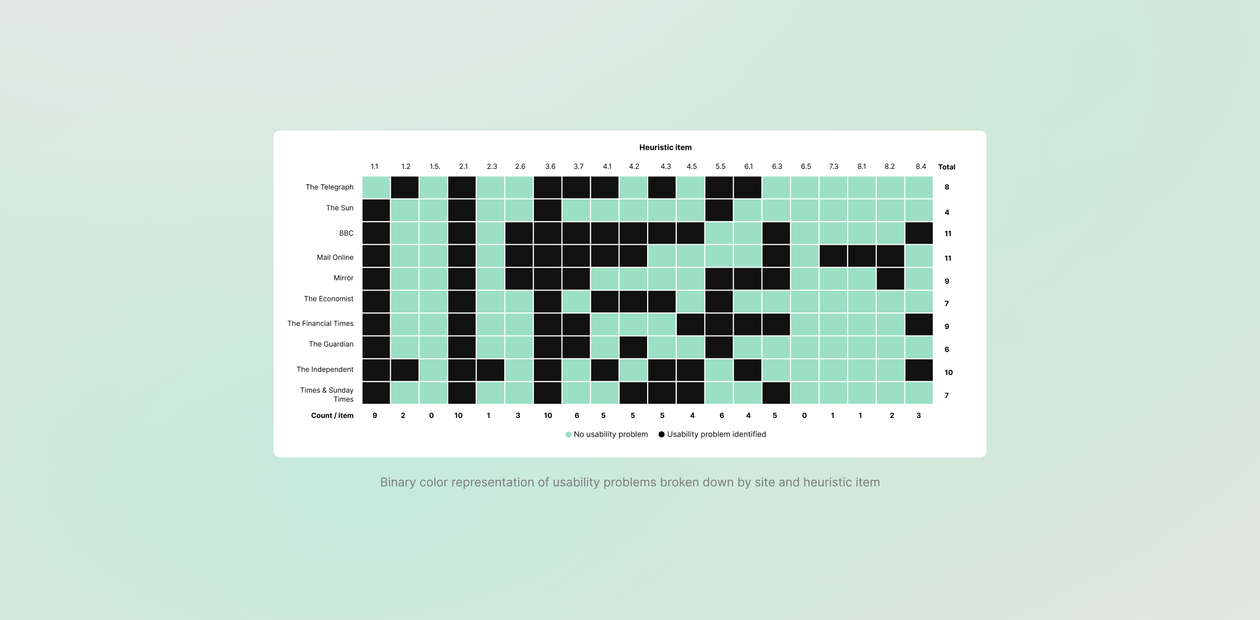
- Common patterns: The evaluation of the navigation bar revealed that all sites had issues. Certain ones were more common than others, such as ambiguous labelling or the lack of clear indicators of the user’s position within the site hierarchy.
- Paid platforms did better overall: Websites like The Economist were more consistent with their scoring recording a reduced number of usability issues compared to free platforms like BBC, which had 11 each.
Inclusive design wins hearts
Accessibility is often overlooked, but it’s critical for reaching a wider audience. With the European Accessibility Act (EAA) taking effect starting with 2025, compliance is about to become a legal necessity for all digital products. Here’s what we found for the news websites:
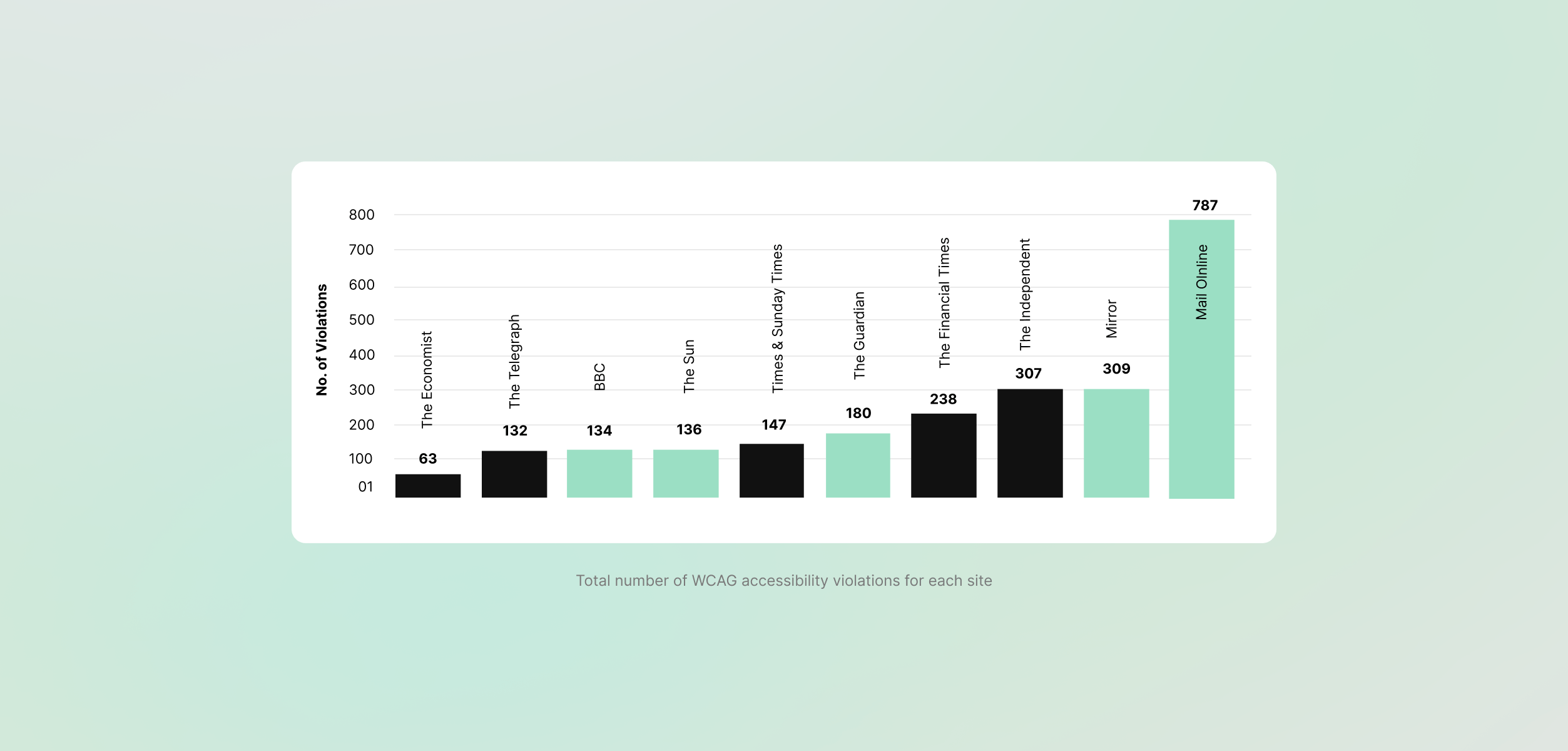
- No perfect scores: No site was in full adherence to the standards. However, our data showed that some were violated more frequently than others. For example, most sites struggled with insufficient contrast ratios and poor text readability.
- Paid platforms did better overall: Sites like The Financial Times and The Telegraph performed well, with designs that made them easier to use for individuals with visual impairments.
Key takeaways for product teams
Do paywalls guarantee a better UX? Not entirely. The predominant trend does place paywall sites as providers of an improved experience due to the reduced number of usability and accessibility issues. That said, when comparing the platforms individually rather than as groups, the best scores were achieved by The Sun, a free-access tabloid platform.
Revenue models alone don’t determine UX quality. Instead, thoughtful design choices, strategic investments, and a user-centred approach are what truly make the difference. Whether your platform is free, paid, or somewhere in between, success hinges on balancing performance, usability, and accessibility. These aren’t just checkboxes; they’re essential elements that directly impact user satisfaction, loyalty, and ultimately, your business’s bottom line.
Whether you’re building a news platform, or any digital product, balancing performance, usability, and accessibility is key. At BoatyardX, we simplify these complexities to create platforms that exceed user expectations.
Read more tech topics
Modernise smarter, scale faster. BoatyardX helps you cut costs and unlock agility by transforming legacy apps through our DiscoverX process and the AWS 7Rs framework.
AI is reshaping how we work, shop, learn, and solve problems, it's creating experiences that seemed impossible just years ago. But what separates AI that transforms businesses from AI that gathers digital dust?
Cloud migration promises scalability, innovation, and long-term cost efficiency. Beneath the surface, however, many organisations encounter unexpected expenses that can derail timelines and budgets.
In recent years, software architectures have evolved rapidly, reflecting the changing needs of software developers and the business environment.
There’s a common belief in the digital world: paying for something guarantees a better experience. But is this always true?
How convenient would it be to have a quick solution at hand for developing a static web page, a proof-of concept application, a single-page application, or even a complete web app built with microservices?
Building a cloud-based product can be daunting for startups, especially when faced with a plethora of choices, trade-offs, and challenges.
Proud of your product but sense it hasn’t quite hit its stride? UX audits are an essential tool to ensure it hits its full potential.
At Adminovate 2024, Karolina Coates, Head of Design at BoatyardX, joined industry leaders to discuss the evolving landscape of user experience (UX) and fintech innovation.
The BoatyardX DiscoverX workshop is a collaborative, interactive experience where clients have the opportunity to explore product and technology concepts.
In today's fast-paced digital landscape, businesses are continually seeking innovative solutions to manage their infrastructure efficiently – and for good reason.
Within the sphere of modern applications, prioritising user experience has become paramount.
Whether you are a startup or a large corporation, it's likely you will face many of the same challenges in building the first version of a new product or application. We explore some of the critical success factors and lessons learned from supporting a broad range of clients in bringing new products to life.
We live in the times when seamless user experiences (UI/UX) are the cornerstone of digital success, businesses are strategically leveraging the nearshore advantage to bolster their design teams.
Before solution and implementation are merged into the upstream branch, a code review is a crucial stage in the software development cycle to obtain a second viewpoint.
Computer vision has become a significant influence in the remaking of numerous sectors in a time when technological innovation is the driving force.
In today's rapidly evolving digital landscape, the success of a product or service hinges on the user experience (UX) it delivers.
With over four years of experience as a .NET developer under his belt, Petru felt it was time to explore the growing demand for DevOps expertise, specifically in technologies.
WebRTC (Web Real-Time Communication) is an open-source transformative technology that revolutionizes real-time audio, video, and data sharing within web browsers.
What do startup founders and enterprise technology leaders have in common? Nightmare stories about unintended consequences of technology decisions.
Cognitive biases can have a significant impact on the quality and effectiveness of software being developed. How can software developers mitigate this impact?
At a recent Microsoft event speakers and attendees struggled to best describe the significance of AI and its potential impact on enterprise.
More organisations are starting to realise that the cloud is a great enabler for innovation, not just a more efficient way of running IT applications and services.
Skill gaps, high employee turnover and fierce competition for limited talent have only added to the pressure that businesses are facing from inflation. Though it may seem counter intuitive, it’s actually a good time to modernise or even replace applications, because they could be compounding your skills challenges.
Meta has called 2023 ‘a year of efficiency’ and they are far from alone in the corporate world. Many businesses are knuckling down, shedding staff and focussing on the old adage of ‘doing more with less’. Belt tightening is a business initiative again, like the bad old days of 2008.
Factors to consider when deciding whether or not to automate your QA.
At close to 4 years old BoatyardX has, for most of its short life, been a remote-first organisation.
How design helps you validate your product ideas within our Discovery Framework.
Have you ever wondered what it takes to have that genius spark that leads to groundbreaking, brilliant ideas?
This article briefly highlights the challenges faced by many software companies, and elements of the solutions we’ve helped map out with them.
This article briefly highlights the challenges faced by many software companies, and elements of the solutions we’ve helped map out with them.
De-risk your product build by answering fundamental product and technology questions up front
Often entrepreneurs skip brand development because of budget limitations or lack of available skillset. A solid brand strategy is, however, the foundation of a successful venture which stands out from the crowd.
An active player on the IT scene, BoatyardX was featured by Today Software Magazine (RO) in tech related topics as a subject matter expert.
When technology isn’t your core business it makes sense to go to an external partner such as BoatyardX. Discover how this approach works for Toronto-based Global Solutions Team.
We were recently interviewed by a new Software Insider website using a Reporter BOT, and it didn't go great! Sometimes #articialintelligence isn't as smart as we'd expect! See what you think.
Irish technology company BoatyardX delivers a compelling case for moving to the cloud to ensure the viability of your operations for the future.
As a growing start up, it’s important not to lose sight of the security and controls required on the IT systems that underpin the business. See how a recent Pen Test has resulted in significant cost savings at BoatyardX.
Pushing a new product live and then helping to demonstrate to early beta customers is a fantastic experience for a software development team.
BoatyardX’s approach to the cloud uses scalable, flexible Kubernetes technology. For businesses undergoing digital transforming, it is the wisest strategy.
Covid-19 represents both a driver and an opportunity for businesses to use digital innovation and build new products and applications more rapidly.


