
Modernise smarter, scale faster. BoatyardX helps you cut costs and unlock agility by transforming legacy apps through our DiscoverX process and the AWS 7Rs framework.

AI is reshaping how we work, shop, learn, and solve problems, it's creating experiences that seemed impossible just years ago. But what separates AI that transforms businesses from AI that gathers digital dust?

Cloud migration promises scalability, innovation, and long-term cost efficiency. Beneath the surface, however, many organisations encounter unexpected expenses that can derail timelines and budgets.
In recent years, software architectures have evolved rapidly, reflecting the changing needs of software developers and the business environment.
There’s a common belief in the digital world: paying for something guarantees a better experience. But is this always true?
How convenient would it be to have a quick solution at hand for developing a static web page, a proof-of concept application, a single-page application, or even a complete web app built with microservices?
Building a cloud-based product can be daunting for startups, especially when faced with a plethora of choices, trade-offs, and challenges.

Proud of your product but sense it hasn’t quite hit its stride? UX audits are an essential tool to ensure it hits its full potential.
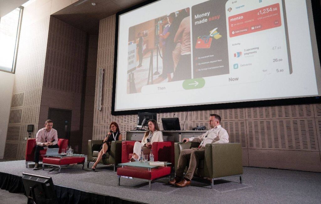
At Adminovate 2024, Karolina Coates, Head of Design at BoatyardX, joined industry leaders to discuss the evolving landscape of user experience (UX) and fintech innovation.

The BoatyardX DiscoverX workshop is a collaborative, interactive experience where clients have the opportunity to explore product and technology concepts.

In today's fast-paced digital landscape, businesses are continually seeking innovative solutions to manage their infrastructure efficiently – and for good reason.

Within the sphere of modern applications, prioritising user experience has become paramount.

Whether you are a startup or a large corporation, it's likely you will face many of the same challenges in building the first version of a new product or application. We explore some of the critical success factors and lessons learned from supporting a broad range of clients in bringing new products to life.

We live in the times when seamless user experiences (UI/UX) are the cornerstone of digital success, businesses are strategically leveraging the nearshore advantage to bolster their design teams.

Before solution and implementation are merged into the upstream branch, a code review is a crucial stage in the software development cycle to obtain a second viewpoint.

Computer vision has become a significant influence in the remaking of numerous sectors in a time when technological innovation is the driving force.

In today's rapidly evolving digital landscape, the success of a product or service hinges on the user experience (UX) it delivers.

With over four years of experience as a .NET developer under his belt, Petru felt it was time to explore the growing demand for DevOps expertise, specifically in technologies.

WebRTC (Web Real-Time Communication) is an open-source transformative technology that revolutionizes real-time audio, video, and data sharing within web browsers.
What do startup founders and enterprise technology leaders have in common? Nightmare stories about unintended consequences of technology decisions.

Cognitive biases can have a significant impact on the quality and effectiveness of software being developed. How can software developers mitigate this impact?
At a recent Microsoft event speakers and attendees struggled to best describe the significance of AI and its potential impact on enterprise.

More organisations are starting to realise that the cloud is a great enabler for innovation, not just a more efficient way of running IT applications and services.

Skill gaps, high employee turnover and fierce competition for limited talent have only added to the pressure that businesses are facing from inflation. Though it may seem counter intuitive, it’s actually a good time to modernise or even replace applications, because they could be compounding your skills challenges.

Meta has called 2023 ‘a year of efficiency’ and they are far from alone in the corporate world. Many businesses are knuckling down, shedding staff and focussing on the old adage of ‘doing more with less’. Belt tightening is a business initiative again, like the bad old days of 2008.

Factors to consider when deciding whether or not to automate your QA.

At close to 4 years old BoatyardX has, for most of its short life, been a remote-first organisation.

How design helps you validate your product ideas within our Discovery Framework.

Have you ever wondered what it takes to have that genius spark that leads to groundbreaking, brilliant ideas?

This article briefly highlights the challenges faced by many software companies, and elements of the solutions we’ve helped map out with them.

This article briefly highlights the challenges faced by many software companies, and elements of the solutions we’ve helped map out with them.

De-risk your product build by answering fundamental product and technology questions up front

Often entrepreneurs skip brand development because of budget limitations or lack of available skillset. A solid brand strategy is, however, the foundation of a successful venture which stands out from the crowd.

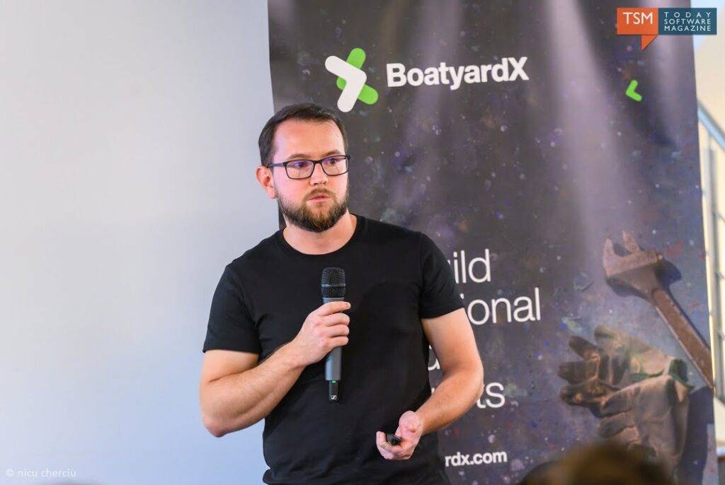
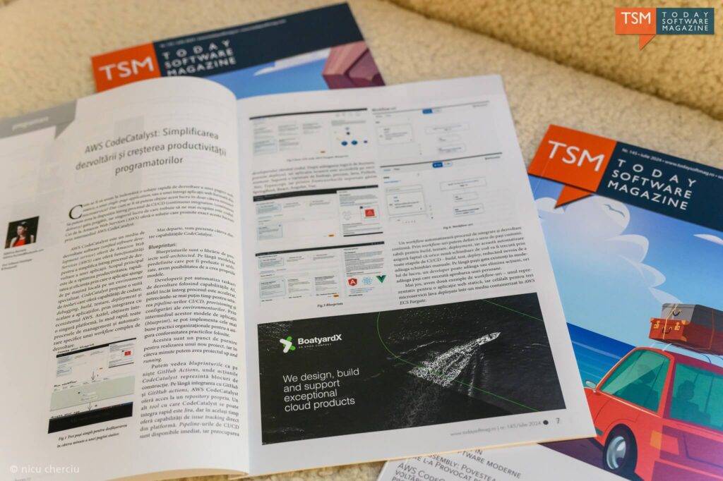
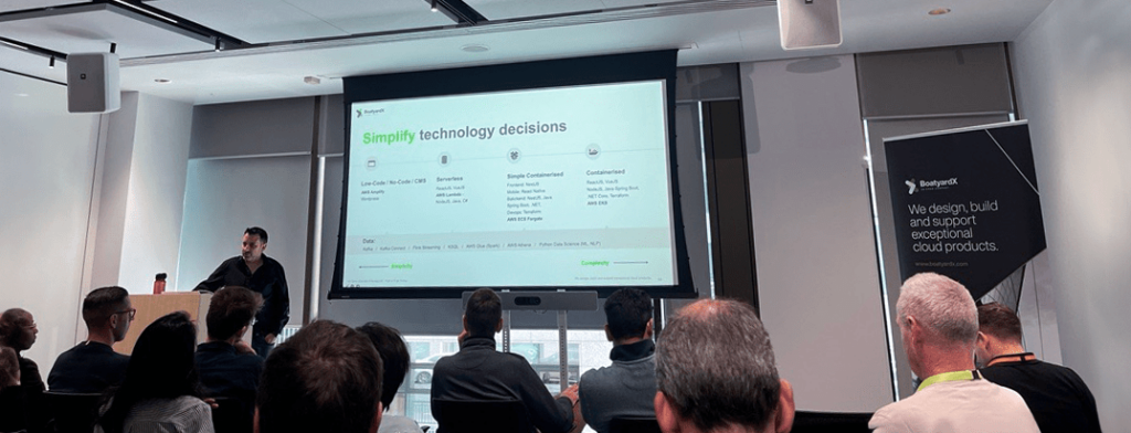
An active player on the IT scene, BoatyardX was featured by Today Software Magazine (RO) in tech related topics as a subject matter expert.

When technology isn’t your core business it makes sense to go to an external partner such as BoatyardX. Discover how this approach works for Toronto-based Global Solutions Team.

We were recently interviewed by a new Software Insider website using a Reporter BOT, and it didn't go great! Sometimes #articialintelligence isn't as smart as we'd expect! See what you think.

Irish technology company BoatyardX delivers a compelling case for moving to the cloud to ensure the viability of your operations for the future.

As a growing start up, it’s important not to lose sight of the security and controls required on the IT systems that underpin the business. See how a recent Pen Test has resulted in significant cost savings at BoatyardX.

Pushing a new product live and then helping to demonstrate to early beta customers is a fantastic experience for a software development team.

BoatyardX’s approach to the cloud uses scalable, flexible Kubernetes technology. For businesses undergoing digital transforming, it is the wisest strategy.

Covid-19 represents both a driver and an opportunity for businesses to use digital innovation and build new products and applications more rapidly.